Layered Patterns For Lasting Depth In Rooms That Actually Get Lived In
Come back to a “finished” room six months later and the miss is obvious. Too many safe solids. Not enough visual friction. It looked pulled together on install day, and then—quietly—it went flat.
Over on ByDesign. industry coverage, you can see the shift before it hits every client Pinterest board. Designers are treating pattern like a neutral again. That’s not a vibe change. It changes how you specify, how you explain the plan, and how long the room stays satisfying.
Here’s what you’ll get from this. A clear way to layer patterns that hold up in real life. And the sourcing and vendor details that keep the look intact after the dog, the sun, the kids, and the actual living show up.
Why Pattern Is Back In Quiet, Serious Ways
Pattern never disappeared. It just got nervous. Social feeds trained clients to fear “busy,” so everyone defaulted to solids and called it “timeless.” One accent pillow became the peace treaty.
Now the mood is changing. According to the House Beautiful 2026 Home Trend Report, designers predict a strong return to layered patterns used as neutrals, paired with sculptural furniture and grounding materials. The report frames it as a durability of style, not a moment. Source House Beautiful 2026 Home Trend Report.
That prediction tracks in the real world too—the business side, not the hashtag side. When pattern does the heavy lifting, you can keep the expensive pieces classic. Clients replace less, regret less, and you don’t get the “can we redo this already?” email two years later.
The Real Problem With Playing It Safe
I’ve watched clients choose solids because they want “timeless.” Two seasons later, they’re bored. Then they want to redo the room. Not because anything was wrong—because nothing was happening.
Solids can be timeless. They can also be empty calories. If the room is relying on silhouette alone, the forms better be fantastic. And not every budget—or vendor list—gets you museum-level shapes and tailoring.
Here’s what most people miss. Subtle pattern reads like texture from across the room. That’s where depth comes from without turning the room into a theme park. If you want a maker-first lens on what actually holds up, spend time in ByDesign. manufacturer highlights and look at what gets repeated year after year (not what gets shouted once and never seen again).
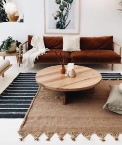
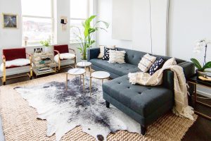
Think In Layers, Not Matching Sets
Layering isn’t “add more stuff.” It’s controlled contrast. The goal is a room that feels collected, not coordinated like a catalog page from 2009.
I think in three pattern roles: an anchor, a support, and a whisper. Skip the roles and you’ll do one of two things—overcook it or chicken out and call it “clean.”
Try this simple structure.
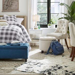
- Anchor pattern on the largest soft surface, often a rug.
- Support pattern on upholstery, sometimes tone on tone.
- Whisper pattern on pillows, small scale, and trims.
You can see how designers describe that balance in real projects inside ByDesign. designer spotlights. Watch how often the “bold” rooms are actually low contrast—your eye reads them as calm because the palette is disciplined.
Make Pattern Feel Neutral With Color Discipline
If you want pattern to behave like a neutral, you don’t “add neutrals.” You control the palette. Keep most patterns inside two to four related hues and let value shifts do the work.
That means your stripe can be navy and ink, not navy and white. Your floral can be tobacco and clay, not every color in the crayon box. (I love color. I also love staying employed. Know your client.)
And don’t spread high contrast everywhere like you’re salting fries. One high-contrast moment is enough in most rooms. After that, your eye needs somewhere to rest or the whole space starts to feel jittery.
For a reminder of what stays classic, revisit five furniture pieces that never go out of style. Pair those silhouettes with patterned layers, and the room lasts longer without feeling like you played it safe.
Start With Materials That Age Like Adults
Pattern is only as good as the substrate. Cheap ground cloth pills, fades, and frays. Then your “quiet richness” turns into sadness.
Natural fibers help, but they aren’t magic. Wool rugs wear beautifully, yet moth risk is real. Linen looks gorgeous, yet it can relax and wrinkle. Cotton takes dye well, yet it can fade in hard sun.
So you specify with your eyes open. Ask for abrasion ratings and lightfastness numbers. If a vendor can’t tell you, they don’t know their product well enough—and you shouldn’t be the one finding that out after install.
For sourcing that leans into responsible materials, point clients to your own standards, then cross-check with ByDesign. sustainable vendors. The goal is beauty that survives real life, not beauty that survives a photoshoot.
Performance Fabrics Are Not Aesthetic Enemies
Designers still talk about performance fabric like it’s a compromise you confess to in a whisper. Some of it is. A lot of it isn’t anymore.
The trick is choosing performance qualities that match how clients live. Heavy-use seating needs real abrasion resistance. Sunrooms need UV stability. Kids and pets need cleanability that doesn’t strip color the first time someone panics with the wrong spray.
Then you layer pattern on top. Pattern hides minor wear better than a flat solid. It buys you time before a piece looks tired, which is the whole point if the room is actually getting used.
This is also where vendor clarity matters. Makers who share specs build trust faster. That theme shows up often in ByDesign. industry articles on trade decision-making and long-term relationships.
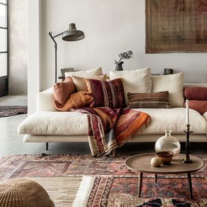
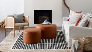
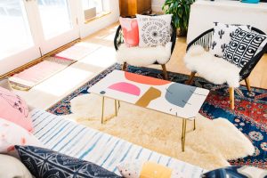
Scale Is The Difference Between Depth And Chaos
Pattern mixing fails on scale more than on style. Two medium patterns fight like siblings in the backseat. One needs to be larger, or smaller. There’s no negotiation.
Here’s a rule that works in most rooms. Combine one large-scale, one medium, and one small. Keep at least one of them low contrast so the room doesn’t vibrate.
Also, think about viewing distance like it’s part of the spec. A bedroom is read from the doorway, then from the bed. A living room is read from multiple seats, across traffic paths, and under different lamps. That changes what “busy” feels like.
If you want a strong example of controlled ornament, look at makers who understand proportion. The point comes alive in the Julie Dasher Rugs spotlight, where pattern is graphic but still livable.
Test In Real Lighting, Not Showroom Lighting
Let’s be real about this. Showrooms are theater. Your client’s house is a different script. (And I say this having walked those showrooms more times than I can count.)
Order memos. Bring samples. View them morning and late afternoon. Check them near the actual wood tones and metals you plan to use, not next to whatever perfect vignette the vendor built for market.
Then do the unglamorous part. Sit on the sofa. Look at the rug from the dining chair. Pattern placement matters where the body actually lands—especially with wide stripes, big repeats, and anything directional.
If you want a sourcing workflow that respects reality, read tips and tricks for online sourcing and adapt it to your sampling process. It saves expensive mistakes.
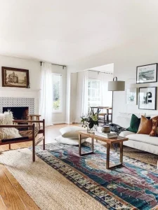
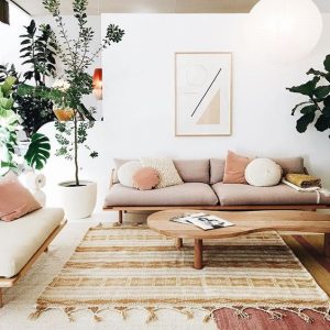
Pair Pattern With Sculptural Forms That Can Hold Their Own
The House Beautiful report ties layered patterns to sculptural furniture for a reason. Form keeps the room grounded when surfaces get complex.
Think about a chair with a strong profile, or a table with a clear stance. Then pattern becomes atmosphere, not noise. It’s a proportion problem as much as a color problem—my NC State brain will die on that hill.
For vendors, this is a product lesson hiding in plain sight: a clean silhouette makes patterned specifications easier. Designers can sell the piece to more clients because it doesn’t fight for attention.
One maker example worth studying is Hellman Chang. The work shows how restraint in form makes richer materials feel calm.
What Vendors Should Share To Win Pattern Forward Specs
Designers don’t need more lifestyle shots. They need decision support. Pattern-heavy rooms raise the stakes on details, and vague answers don’t fly when you’re mixing repeats and trying to keep a project on schedule.
If you’re a vendor partner, publish the specs designers actually ask for.
- Double rub counts and testing method used
- Lightfastness ratings and recommended placement
- Fiber content and backing details for rugs
- Finish schedules and care instructions in plain language
- Lead times that reflect reality, not hope
Business of Home has covered how transparency impacts trade trust and purchasing decisions in a tough market. Reference Business of Home for ongoing reporting on what designers demand from brand partners.
This isn’t about perfection. It’s about being clear. Clarity is what gets you specified again—especially when a designer is building a layered scheme and can’t afford surprises.
Client Messaging That Makes Pattern Feel Safe
Clients fear regret. Pattern feels like a commitment, even when it isn’t. Your job is to translate it into practical terms, not design-theory terms.
Try language like this. Pattern is a neutral when the palette is controlled. Pattern is forgiving when life happens. Pattern is easier to update than casegoods.
Then show them a plan. If they can see the structure—anchor, support, whisper—they calm down. I’ve watched this play out so many times in client meetings where everyone was one swatch away from spiraling.
For designers looking to protect margin and sanity while guiding decisions, revisit five things to do now for the health of your business. Client education is a business tool, not just a design nicety.
Depth That Lasts Comes From Honest Wear
Patina isn’t failure. It’s proof of life. The room should get better as it gets used, not more precious and stressful to live in.
So choose finishes that mellow, not peel. Choose textiles that fade gracefully, not unevenly. Choose rugs that can take traffic without looking crushed at the first bend in the pile.
If you build the layers right, the room stays interesting. It also stays believable. That’s the kind of “timeless” clients actually mean when they say the word.
Explore What DesignerInc Has to Offer
If you’re specifying layered pattern stories, you need partners who can back up the details. If you’re a maker, you need designers who care about the craft, not just the photo.
That’s why I send people to DesignerInc. It’s where the trade finds each other, then does better work together—cleaner specs, fewer surprises, and pieces that still look right after the room has been lived in.