Catherine Sands Designer Spotlight and the Calm That Still Works Hard
Some rooms look like they exhaled—and still, they’re doing the work. That’s the sweet spot Catherine Sands hits again and again at Blue Daze Designs. If you want “livable coastal” without the costume jewelry (no rope knots, no anchor cosplay), pay attention. This is restraint with a backbone.
I’m grounding this in the DesignerInc editorial world because the platform tends to reward what holds up: the materials that don’t disappoint at install, the sourcing decisions that don’t wreck a schedule, and the kind of design thinking that looks even better six months after move-in. Start with DesignerInc editorial coverage if you want the bigger picture behind the makers, materials, and standards designers are actually leaning on right now.
What Catherine Sands Gets Right About Coastal Calm
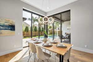
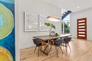
A lot of “coastal” interiors reach for the obvious signals. Blue-and-white stripes, a nautical wink, the kind of décor that feels like it came in a set. Catherine takes the harder route, and it reads more adult.
She builds the mood with texture and proportion first—because if the silhouettes are wrong, no paint color is going to save you. Then color comes in quietly, like a low voice you lean toward instead of a loud one you try to ignore. You’ll catch the sea-and-sky references, but they’re filtered through neutrals and softened edges that don’t beg for attention.
If you follow the DesignerInc stream of designer perspectives in the Designers section, you’ll notice the same tell across the strongest work: the room doesn’t announce a theme. It just feels right. That’s the whole point.

The Real Skill Is Balance, Not a Signature Look
Here’s what most people miss about “easy” rooms: they’re usually the hardest to pull off. Relaxed takes discipline, or you end up with visual drift—nothing offensive, nothing memorable, and somehow the client still feels unsettled in it.
Catherine’s work holds the line between breezy and intentional. The layers are there, but they don’t chatter. The shapes stay clean, but the room doesn’t go flat or sterile. That balance isn’t an accident; it’s editing. Real editing, not “I deleted a pillow and called it minimal.”
This is also why designers keep talking about restraint in DesignerInc industry coverage. Clients want comfort, sure. They also want a point of view they can’t quite name—but they can absolutely feel when it’s missing.
Inside Her Process, Project Management Matters
Designers love to talk aesthetics. Clients are living inside the calendar. Catherine’s background in project management shows up in the calm way she guides remodels and full-home work, even when the middle gets messy (because it always does).
Let me put it plainly: taste doesn’t rescue you when the timeline slips, the sofa arrives wrong, or install day turns into a group stress test. Structure does. Clear approvals. Clean communication. A plan that doesn’t crumble the minute a backorder hits.
That’s why I like seeing process show up next to product stories in DesignerInc industry articles. The business side and the beautiful side are the same job most days. Anyone telling you otherwise hasn’t managed an actual project.
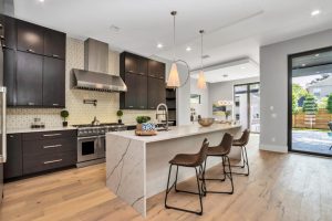
Small Details That Make a Room Feel Alive
Catherine’s work isn’t about filling space. It’s about pacing it. A vintage lamp lands like a quiet punch. A woven stool adds a human note. And yes—light at 4 p.m. gets treated like a design element, not an afterthought.
Those “small” choices are usually the difference between a styled photo and a room people love living in. The best designers choreograph how life moves through a space: where you drop your keys, where you perch with a coffee, where you actually sit when you’re tired. They don’t just decorate it.
You’ll see that same obsession with detail in maker stories across the Manufacturers category, where craft and finish choices get the attention they deserve. That’s where soulful rooms start—in the specs, not in the caption.
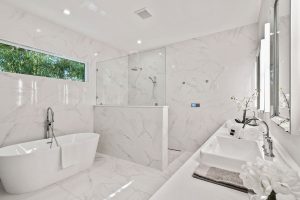
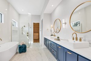
Why Textures Do More Than Color Ever Will
Color gets all the credit because it’s the loudest decision, but texture is what holds a room together. Especially in homes that need to feel calm, not blank. Catherine leans into layered materials, and that’s a smart long game.
In practical terms, texture does three things for you.
- It adds depth without visual clutter.
- It hides real life better than flat finishes.
- It keeps neutral palettes from feeling cold.
There’s a reason designers are still talking about natural materials and tactile interiors in outlets like Architectural Digest. Trend cycles keep spinning, but people keep wanting rooms that feel good to touch—and that don’t punish them for living.
If you want to see how makers build that dimension into products, browse Manufacturer Featurettes mid-spec. It’s a good reminder that material honesty shows immediately in a finished room. You can spot the real thing the moment light hits it.
The Honest Truth About Livable Luxury in 2026
Clients want homes that feel elevated and still forgive them. That’s not a contradiction—it’s the assignment. Catherine’s rooms land there because she’s thinking about function from the start, not tacking it on after the photos are taken.
Performance fabrics, sensible circulation paths, and finishes that age well will beat a viral moment every time. I’ve watched this play out more times than I can count. The “perfect” white sofa is only perfect until the first birthday party, the first red wine, or the first dog who decides that cushion is theirs now.
Business of Home has tracked how client expectations are shifting toward comfort and real use, not just showpieces. Keep an eye on Business of Home if you’re pricing, pitching, and managing those expectations every day.
DesignerInc also keeps that reality front and center in Editorial Highlights, where the conversation stays grounded in what actually works once a house becomes a home.
Sourcing That Supports the Mood, and the Schedule
Calm interiors still require hard decisions. Lead times, finish samples, freight, COM, backorders. The number of designers who ignore lead times until it’s an emergency still floors me. (And yes, I’ve been in those client meetings where it comes up too late.)
Catherine’s mix of creativity and organization is the antidote. Plan sourcing early and you protect the design intent. You also protect your sanity—because nothing kills “calm” faster than a last-minute substitution that doesn’t match the rest of the room’s temperature.
If I had to pick one sourcing habit that changes everything, it’s this: keep a tight bench of trusted makers and partners, then specify inside that circle. DesignerInc reinforces that approach through its relationships focus in Relationships by Design, because strong projects are built on strong trade connections. Period.
Explore the DesignerInc Community
If Catherine Sands’ work resonates, take it as a cue to tighten your own lens. Calm doesn’t mean simple, and “easy” rooms usually come from serious decisions—the kind you make before anyone sees a pretty reveal shot.
DesignerInc is one of the few places that consistently connects design culture to the making and sourcing behind it. Spend time there and you’ll walk away with sharper instincts—and fewer expensive surprises.
Visit and Follow Catherine Sands
Website: https://bluedazedesigns.com
Instagram: https://www.instagram.com/blue_daze_designs/