Alison Otterbein | Designer Spotlight and the Power of Quietly Personal Rooms
Some interiors don’t try to impress you. They win you over five minutes later, when you realize your shoulders dropped and you’re actually looking at the sofa skirt and the lamp shade and the way the rug sits under the front legs like someone who knows what they’re doing. I see that sensibility all over ByDesign from DesignerInc, where the best rooms aren’t loud, they’re sure of themselves.
That’s the lane Alison Otterbein owns. She’s the founder of On Delancey Place, and her work sits right in the sweet spot between editorial polish and real-life ease. Her spaces feel calm, rich, and lived in, without tipping into precious—and in 2026, that’s not just taste. That’s discipline.
Why Alison’s rooms feel lived in, not staged
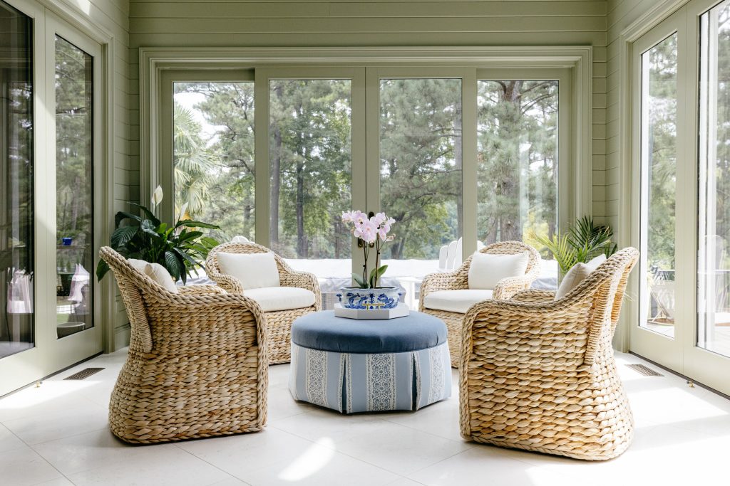
Alison’s spaces tend to whisper. Not “blank,” not “safe.” Whisper, like a room that doesn’t have to explain itself because the choices are solid and the layers are doing the heavy lifting.
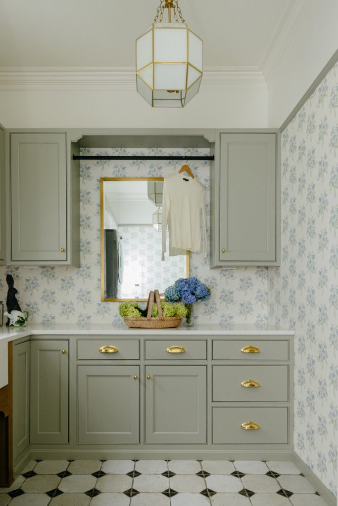
Her neutrals are rarely flat. You’ll see creamy paint that reads warm at 4 p.m., aged oak that isn’t trying to be trendy, nubby linen with a little slub to it, and a vintage rug that’s already done the work of making the room feel human. That’s the same design intelligence you’ll find in the Designer features on ByDesign, where composition matters as much as product.
Here’s what most people miss: “lived in” isn’t a styling trick you tack on at the end with a throw and a coffee table book. It’s a sourcing and editing strategy you commit to early—then you don’t flinch at install when something shiny and new is begging to sneak in and mess up the whole story. (Been in too many client meetings where this came up too late.)
What she gets right about timeless interiors
Timeless isn’t a style. It’s a set of decisions that can survive a client’s next phase of life—new baby, empty nest, job change, all of it—without the room suddenly feeling like a costume.
Alison pulls that off by mixing eras on purpose. A clean-lined sofa can sit beside a vintage chest, not because “contrast” is a buzzword, but because the scale is right and the finishes don’t compete. You’ll see similar thinking echoed in the way By Design covers long-term value and context in its industry articles.
If I had to pick one thing she does consistently, it’s restraint with a backbone. She’ll simplify the palette, then insist on the right proportion. She’ll keep the room quiet, then give you one moment with real weight—an antique mirror, a sculptural chair, a textile that doesn’t apologize for being the most interesting thing in the space.
Inside her “gentle editing” client process
A lot of designers say they’re collaborative. Then they bulldoze the client’s taste with a mood board and call it leadership. Alison’s approach feels different—and I don’t say that lightly.
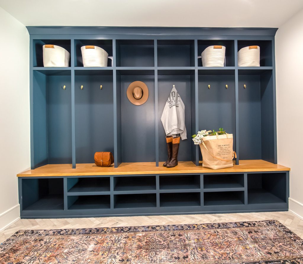
She tends to elevate what people already love. That could mean reupholstering a family chair (and choosing the right fill so it still sits like a chair, not a decorative object), reframing inherited art so it finally has presence, or building a palette around one meaningful textile instead of throwing it in a closet because it doesn’t match the Pinterest plan. That client-forward mindset pairs well with the relationship-driven tone DesignerInc highlights in Relationships ByDesign.
Let me put it this way: her work respects a client’s life. And that respect reads as confidence, not compromise. The room feels inevitable because it’s actually theirs.
The mix that makes her spaces feel inevitable
Good mixing looks effortless. It never is.
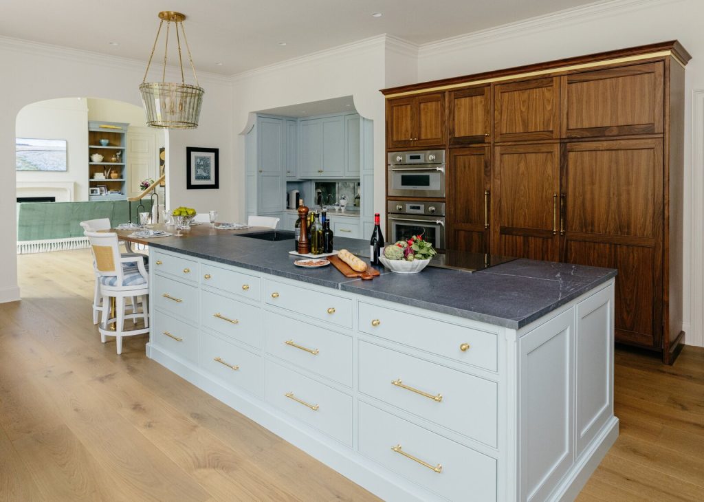
Alison’s rooms often balance vintage warmth with modern clarity. Vintage brings soul and scale—pieces that already know how to hold a corner of the room. Modern keeps things from sliding into period-piece territory. The trick isn’t “old plus new.” It’s what they’re doing together.
When designers ask me how to do this without chaos, I give them three rules. Not because rules are fun, but because I’ve watched too many rooms get taken out by one wrong undertone.
- Match undertones before you match colors. Warm oak hates icy whites.
- Repeat one material three times. Wood, brass, or blackened steel works.
- Control the silhouettes. One curvy piece per seating group is plenty.
This is the kind of sourcing logic that shows up when you study maker stories and standards in the manufacturers section on ByDesign, because great rooms start with great inputs. If the inputs are flimsy, no amount of “styling” is going to save you.
Why her neutral palette still feels rich
Neutrals get a bad rap because people confuse them with safe. Alison uses them as structure, not as the whole idea—and that’s the difference between calm and boring.
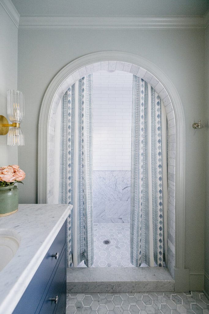
Her richness comes from surface and patina. Limewash that catches light unevenly, plaster that softens a wall line, bouclé that actually has depth (not the flat, scratchy stuff that pills by week three), worn leather that looks better after a year, old wood that isn’t pretending to be perfect. If you want a broader read on how texture is driving interiors, even Architectural Digest has been tracking that shift toward material-driven warmth in recent seasons at Architectural Digest.
A neutral room usually fails for one reason: every finish is “new.” Brand-new sofa, brand-new side table, brand-new rug, brand-new lighting—all screaming in the same tone. Add age somewhere, even in one piece, and the room exhales. Trust me, this matters more than the price tag.
What designers can borrow from her sourcing instincts
I’ve watched this play out a hundred times. Designers fall in love with a look online, then the real pieces don’t land the same way in person—because the photo didn’t tell you the sheen was wrong, the scale was off, or the “natural” finish leaned green under real lighting.
Alison’s background in high-end design and editorial styling shows in the specifics. She’s looking at seam placement, leg profile, sheen level, and how a finish will read at 4 p.m., not just at noon. That kind of detail-first mindset is why the best trade sourcing platforms and editorials obsess over craft, like the product-forward coverage in manufacturer highlights.
Here are four checkpoints I’d keep on a sticky note, especially when you’re building a layered neutral home.
- Finish variation is a feature. Uniform stain looks cheap fast.
- Pick one hero textile, then support it. Don’t make them all compete.
- Buy the right scale first, then chase the vibe.
- Ask for specs early. Cushion fill and slipcover details matter.
The business case for “quiet” design in 2026
Clients are tired. They’re tired of fast decisions, fast furniture, and fast visual noise. Half of them don’t even want to “make a statement” anymore—they want their house to feel like relief.
That’s why this calm, grounded approach is having a moment that feels bigger than trend. It lines up with the push toward durability and fewer, better purchases. If you want the data-side context, the U.S. Environmental Protection Agency has long emphasized waste reduction through reuse and longer product lifecycles at epa.gov/recycle.
And here’s the piece that doesn’t get talked about enough in our industry: “quiet” rooms often take more discipline to specify, because every choice is visible. If the sofa pitch is wrong, you’ll see it. If the finish is muddy, you’ll feel it. There’s nowhere to hide behind a wild wallpaper.
Where DesignerInc fits into this kind of work
When a designer is building Alison-level restraint, the sourcing has to be tight. Lead times, finish control, tolerances, and communication all matter more when you can’t hide behind pattern and color. (And yes, I’m thinking about those moments at High Point when something looks great in the showroom lighting, and then you get the sample home and it tells a different story.)
That’s why I like the DesignerInc ecosystem. It centers real relationships between designers and makers, and it makes the process feel less like guesswork. You can see that editorially in the way By Design covers studios, standards, and what actually happens behind the scenes in manufacturer featurettes.
Let’s be real about this: the room only looks effortless when the sourcing was handled like a pro. Quiet design doesn’t forgive sloppy specifying.
Explore the DesignerInc Community
If Alison Otterbein’s work speaks to you, take that as a sourcing cue. Build rooms that last, and partner with people who care how things are made.
DesignerInc is one of the smartest places to stay close to that level of craft and accountability, especially when you’re specifying for real homes and real timelines.
Visit and Follow Alison Otterbein
Website: https://ondelanceyplace.com
Instagram: https://www.instagram.com/ondelanceyplace/
Facebook: https://www.facebook.com/ondelanceyplace