Erica Andrews | Designer Spotlight, and the Quiet Art of Lived In Luxury
You can tell in about ten seconds when a home is actually working. The room doesn’t feel posed for a camera. It feels steady. Calm. Like someone can put a mug down without apologizing for existing.
That’s the lane ByDesign by DesignerInc keeps coming back to, because that’s where real projects either hold up or fall apart. And it’s where Erica Andrews does her best work. She understands that “pretty” is the entry fee, not the finish line.
Here’s what to watch for in her rooms: neutrals that don’t go dead, contrast that doesn’t shout, and the kind of tailoring that makes a house feel like a soft landing instead of a showroom set.
Why Erica Andrews’ Rooms Feel Instantly Calm
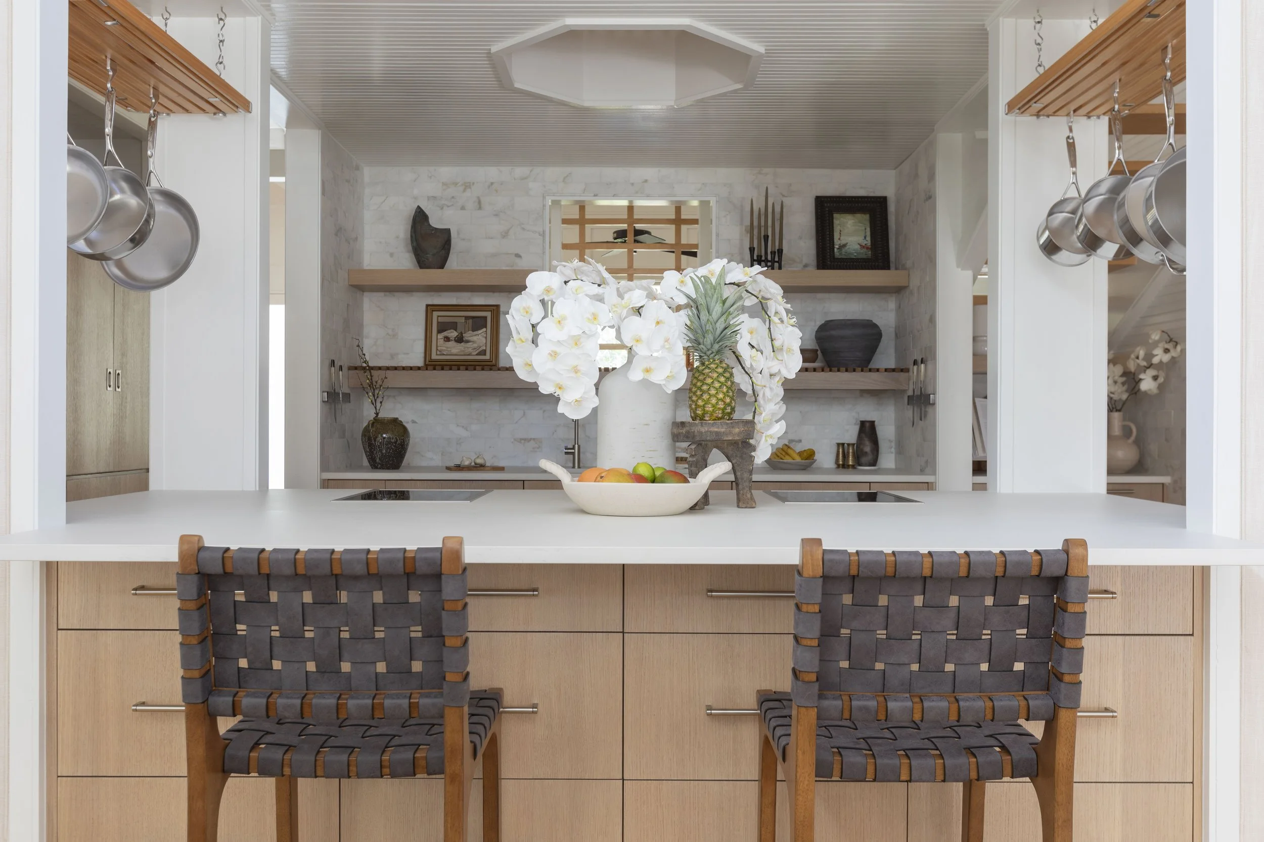
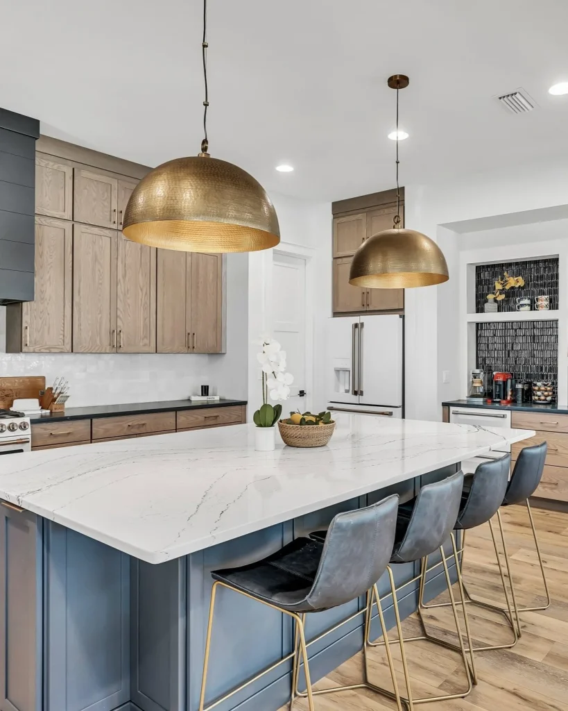
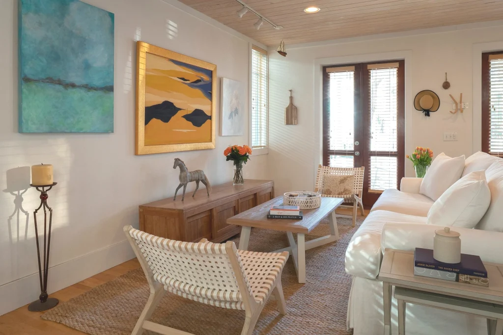
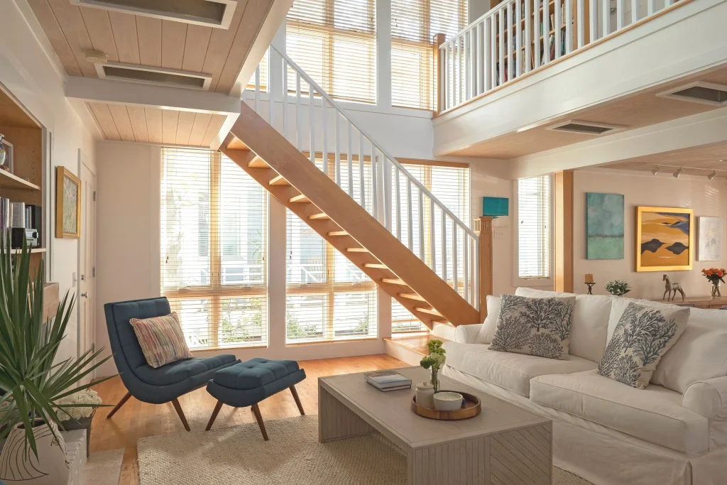
Erica Andrews’ spaces don’t hustle for attention. They earn trust. The palette stays grounded, the layers feel intentional, and nothing looks like it got panic-ordered to hit a photo deadline.
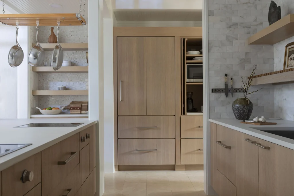
She’ll start with a neutral base, then build the kind of dimension you feel more than you “see.” Linen against oak. Flat paint near a soft sheen. A vintage profile parked next to something clean lined so the room doesn’t get too precious.
That same layered thinking shows up all over the DesignerInc editorial world, especially when designers talk about sourcing pieces that still look good after the big reveal fades and real life moves in. Spend time in the designers section on ByDesign and you’ll notice the through-line: the best rooms stay quiet on purpose. They don’t rely on trendy noise to feel finished.
The Corporate Background Advantage That Designers Don’t Talk About
A lot of designers have taste. Fewer have operational clarity. Erica’s corporate background reads as an extra gear—less chaos, cleaner decisions, fewer “we’ll figure it out later” moments that always cost someone money.
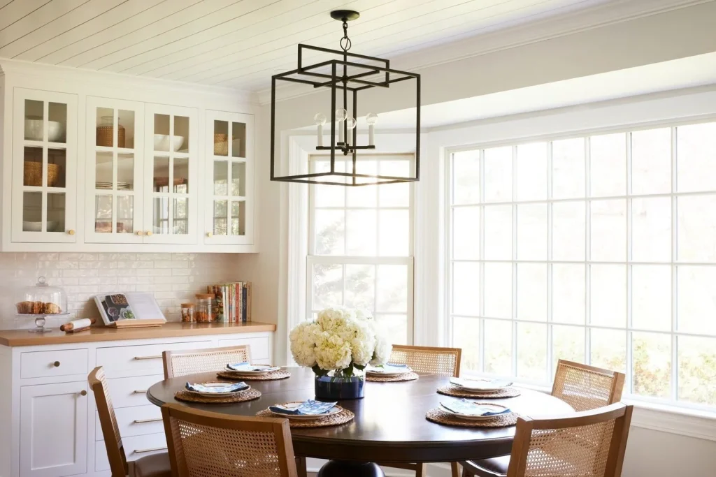
Let’s be honest. A family room isn’t a vignette. It’s traffic and snack crumbs and homework spread like a crime scene, plus a dog who’s convinced the sofa was purchased for them.
So when a designer links beauty to workflow—not just finishes—I pay attention. DesignerInc keeps pressing that point in its industry coverage because the business side shows up in the final room every single time (lead times, trades, what gets approved, what gets value-engineered to death). If you want that angle, the industry section on ByDesign is where the straight talk lives.
Subtle Contrast Is the Real Signature
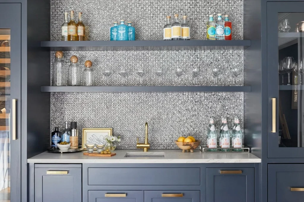
A lot of people hear “contrast” and immediately reach for black trim or a loud tile. That’s one way to do it, sure. But Erica uses contrast the way a good stylist does: in small shifts that add up, so the room feels pulled together without looking like it’s trying to prove a point.
Here are a few contrasts that read “timeless” in real homes.
- Old and new, like a refined sofa near a worn wood table
- Light and shadow, through layered window treatments and warmer lamps
- Polish and patina, with finishes that don’t all match perfectly
Here’s what most people miss: contrast is also a sourcing problem. You need access to makers who can hit different notes without the whole room turning into a quality mismatch. (Been in too many client meetings where one piece arrives and suddenly everything else looks cheap.) That’s why I send designers to the manufacturers category on ByDesign when they’re building a layered spec. Mixing is easier when the quality level stays consistent.
Neutrals That Don’t Go Flat
Neutral rooms fail when they rely on color alone. Beige plus white plus gray isn’t a concept. It’s just indecision in a trench coat.
Erica’s neutral work stays alive because she leans on texture and temperature. Warm woods. Rugs with real hand and density. Fabrics with a visible weave you can clock from across the room. That’s where depth comes from—material, not paint chips.
If you want backup for why natural materials matter right now, Business of Home has tracked how clients keep asking for warmth and longevity, not disposable finishes. You can see that shift in their reporting at Business of Home. It’s changing what designers specify, especially in family heavy homes where a “delicate” choice turns into a regret fast.
Function First Does Not Mean Boring
I’ve watched this happen a hundred times. A designer gets spooked about durability, so the room turns overly safe. Performance fabric on every surface. Nothing with nuance. Nothing that feels like a person lives there—just a checklist of “won’t stain.”
Erica sidesteps that trap by making function part of the beauty. A kitchen that hosts real meals can still feel tailored. A primary suite can be practical and still feel like a retreat. The point isn’t to baby the room; it’s to design it so the household doesn’t have to tiptoe.
If you want more examples of how designers and brands talk about that balance, spend time in the editorial highlights on ByDesign. The strongest projects tend to solve comfort, maintenance, and mood in the same breath—and you can feel the difference the second you walk in.
The Process That Makes Design Feel Accessible
Accessibility in design gets misunderstood. It doesn’t mean lowering standards. It means guiding clients through choices with less friction and fewer surprises (because surprises are cute in a movie and brutal on a renovation timeline).
Erica offers full service design and e-design, which tells me she respects different project realities. Not everyone has the bandwidth for ongoing in-person meetings, and not every budget can absorb endless revisions. Time, location, cash flow, decision fatigue—it all counts.
Here’s a process rhythm that usually works for this kind of calm, collected interior.
- Set the non negotiables early, like layout, function, and key furniture sizes
- Lock the foundational finishes, since they control the whole temperature
- Layer lighting, textiles, and objects last, once the room has a pulse
That structure tracks with how a lot of DesignerInc community designers approach sourcing too, especially when lead times get weird and you can’t pretend everything will arrive in a neat little bundle. If you want more of that behind the scenes reality, these industry articles on ByDesign are a smart read.
What Every Designer Can Learn From Her “Soft Landing” Rooms
Designers love the reveal. Clients live in the Tuesday night of it all. That’s where Erica’s work is instructive: these rooms are built for decompression, not performance.
If I had to steal one thing from her approach, it’s the commitment to comfort that still looks elevated. Cushions that invite you in. Lighting that’s forgiving at 9 p.m., not just flattering at noon. Materials that don’t punish the household for existing.
Architectural Digest has covered the larger shift toward comfort driven luxury, and it’s not a passing mood. Their interiors coverage at Architectural Digest keeps circling the same truth: homes are getting more personal, less performative. Good. Designers have been cleaning up after performative design for years.
Explore the DesignerInc Community
If Erica Andrews’ work hits your sweet spot, stay in that world. DesignerInc is where designers trade notes on sourcing, makers, and what actually holds up once the client moves in and stops treating the room like a museum.
It’s also where the usable details live—the ones you can take straight into your next spec without blowing up your whole process.
Visit and Follow Erica Andrews
Website: https://www.ericaandrewsinteriors.com/
Instagram: https://www.instagram.com/the_erica_edit/